Demystifying Post-Processing (to an extent)
I said in the last post that I would put up some “before” and “after” images that would give people an insight into how much post-processing I do to my photographs, so here we go. As with the last post this isn’t a tutorial, but those who have a better than basic understanding of post-processing may get some ideas from this post. The “before” images which are unprocessed, as interpreted by “Caputre One”, they are on top and I have listed the key things which I have done with the post-processed "after" photographs. Click on each image for a closer view. 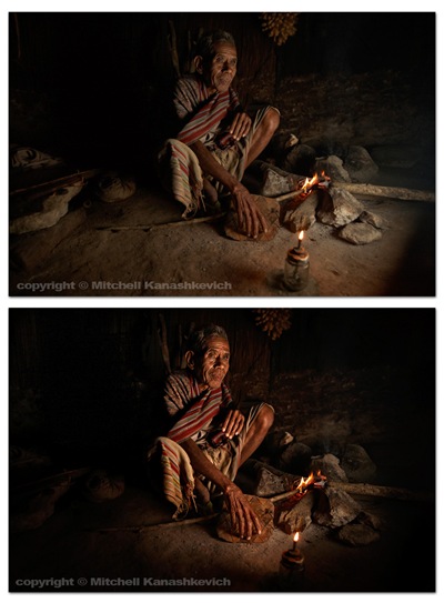
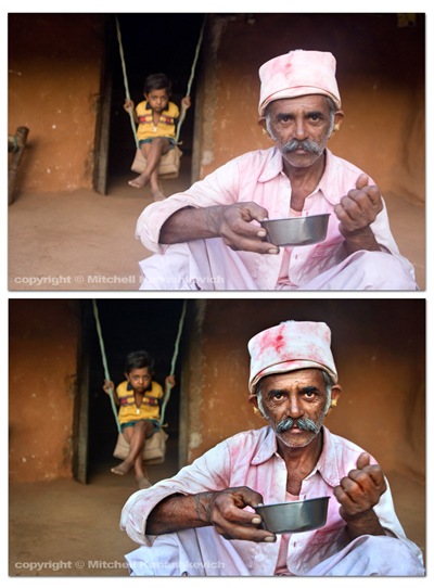
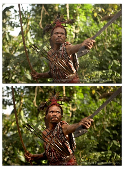
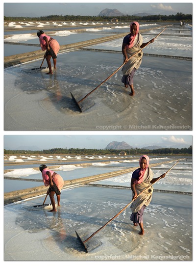 The above images have pretty much been worked on in the same way.
- Slight cropping and sometimes rotating.
- Multiple versions of the same image created at varying exposures, later made into one in Photoshop. The reason – bringing out the details in highlights and shadows.
- Curves, levels adjustment layers created, I paint inside of these wherever I feel needed, to selectively darken and lighten areas
- Shadows and highlights – to further bring out the details.
- Dodging and burning for finishing touches.
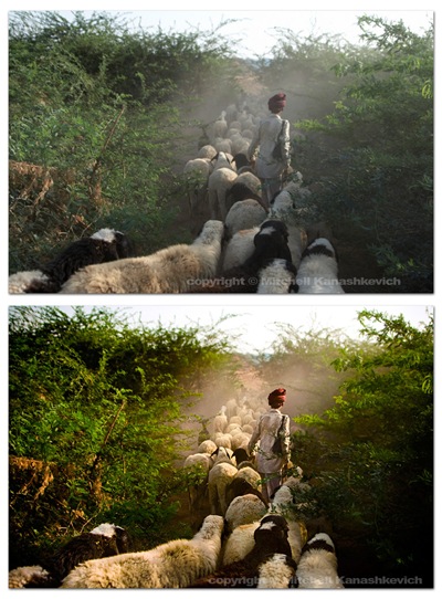 The image above had a little more done to it. On top of the previously mentioned processes I played around with the saturation and the white balance in the RAW file. More intense dodging and burning was required to add a bit of drama to the scene, to make the image look the way I remembered seeing it.
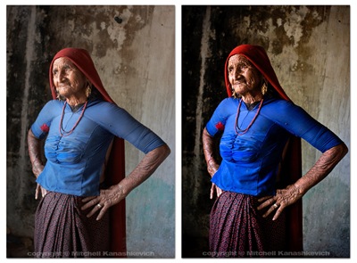 The process for the image of this grandmother was similar to the first few and I chose to clone out a little black pipe that stuck out of the wall (top/center/right). I’m not a huge fan of cloning things out and some may argue that once things start to get modified on this level, the photograph becomes less “pure”. If it’s something small that doesn’t make or break the image, but bugs me I’ll clone it out without thinking twice, if it’s something that can radically change an image I’ll usually be a bit more cautious.
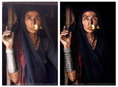 Out of the images I have presented here this one required the most work. I felt that I really needed to bump the contrasts and to dramatically darken certain parts of the photo. This sRGB conversion has a limited color range and is actually a little too dark (you loose details in the material), but you get the general idea. Same processes as stated above and just really a lot of playing around and seeing what works and what doesn’t.
That’s about it. As you can probably gather I like to keep my images looking as realistic as possible on the one side and as dramatic as possible on the other. I try to find the right balance. There are plenty of photographers who like to make their images look more dramatic, more saturated, more contrasty, to a point of surreal. There are also those who like to selectively de-saturate parts of an image, but to keep contrasts high. Lots of particular “looks” are popular these days and many people try to emulate them. Sometimes these “looks” work and sometimes they are boring, repetitive and unnecessary. I’m not really into stylizing my color shots too much. I feel that this is a bit of a fad and at times this stylization is used to mask crap light or inconsistent color. A great image will be great regardless of whether it has been realistically processed or stylized (when this is done well). A crap, stylized image may pass off as decent at first glance because it grabs you with the dramatic, surreal color, but hang it on the wall and look at it for a few days and you’ll become very bored. Maybe I am somewhat conservative - for me it’s either the dramatic, yet realistic post processing approach or if I want to do my own kind of stylizing – it’s black and white. I do quite a bit of black and white and I will post something about that in the future.