Natural light is the most powerful tool that we as photographers have at our disposal. The best thing about it is that it's free and available to absolutely everyone. The other great thing is that we don't need a boatload of expensive gear to take powerful images, once we understand how to use this tool, some of the images I've included as examples in this ebook were taken with my iPhone 4S (not the most powerful or expensive camera to say the least). No matter what camera you use - you can benefit from having a better understanding of natural light.
Demystifying Post-Processing (to an extent)
I said in the last post that I would put up some “before” and “after” images that would give people an insight into how much post-processing I do to my photographs, so here we go. As with the last post this isn’t a tutorial, but those who have a better than basic understanding of post-processing may get some ideas from this post. The “before” images which are unprocessed, as interpreted by “Caputre One”, they are on top and I have listed the key things which I have done with the post-processed "after" photographs. Click on each image for a closer view.
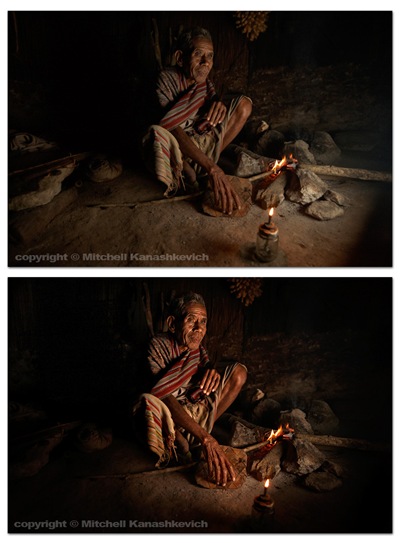
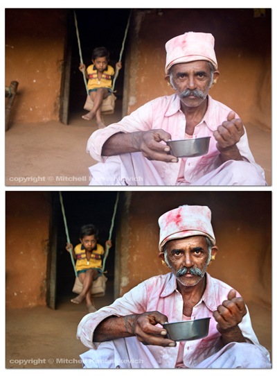
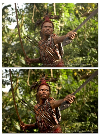
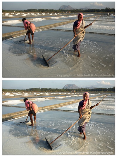 The above images have pretty much been worked on in the same way.
- Slight cropping and sometimes rotating.
- Multiple versions of the same image created at varying exposures, later made into one in Photoshop. The reason – bringing out the details in highlights and shadows.
- Curves, levels adjustment layers created, I paint inside of these wherever I feel needed, to selectively darken and lighten areas
- Shadows and highlights – to further bring out the details.
- Dodging and burning for finishing touches.
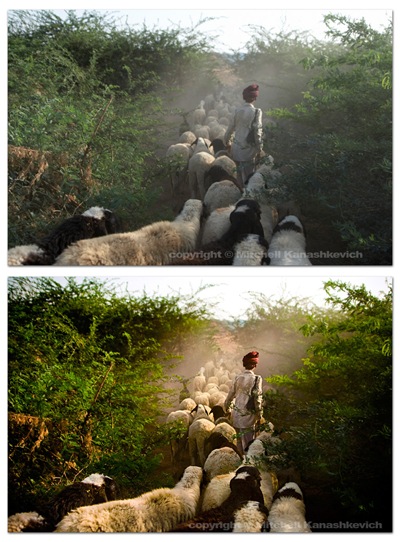 The image above had a little more done to it. On top of the previously mentioned processes I played around with the saturation and the white balance in the RAW file. More intense dodging and burning was required to add a bit of drama to the scene, to make the image look the way I remembered seeing it.
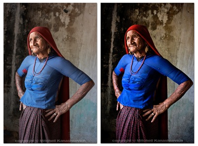 The process for the image of this grandmother was similar to the first few and I chose to clone out a little black pipe that stuck out of the wall (top/center/right). I’m not a huge fan of cloning things out and some may argue that once things start to get modified on this level, the photograph becomes less “pure”. If it’s something small that doesn’t make or break the image, but bugs me I’ll clone it out without thinking twice, if it’s something that can radically change an image I’ll usually be a bit more cautious.
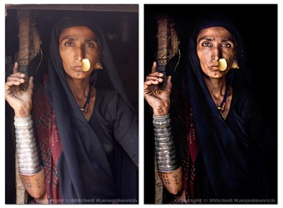 Out of the images I have presented here this one required the most work. I felt that I really needed to bump the contrasts and to dramatically darken certain parts of the photo. This sRGB conversion has a limited color range and is actually a little too dark (you loose details in the material), but you get the general idea. Same processes as stated above and just really a lot of playing around and seeing what works and what doesn’t.
That’s about it. As you can probably gather I like to keep my images looking as realistic as possible on the one side and as dramatic as possible on the other. I try to find the right balance. There are plenty of photographers who like to make their images look more dramatic, more saturated, more contrasty, to a point of surreal. There are also those who like to selectively de-saturate parts of an image, but to keep contrasts high. Lots of particular “looks” are popular these days and many people try to emulate them. Sometimes these “looks” work and sometimes they are boring, repetitive and unnecessary. I’m not really into stylizing my color shots too much. I feel that this is a bit of a fad and at times this stylization is used to mask crap light or inconsistent color. A great image will be great regardless of whether it has been realistically processed or stylized (when this is done well). A crap, stylized image may pass off as decent at first glance because it grabs you with the dramatic, surreal color, but hang it on the wall and look at it for a few days and you’ll become very bored. Maybe I am somewhat conservative - for me it’s either the dramatic, yet realistic post processing approach or if I want to do my own kind of stylizing – it’s black and white. I do quite a bit of black and white and I will post something about that in the future.
My Digital Workflow and Why I don't use Lightroom
 Ok, so I thought it might be useful to let people know how I go about working on my images after I have captured them with the camera. This is not a tutorial, just some steps that I take, a word on the software that I use and some thoughts behind why I use it.I’ll start with a statement that will likely surprise many photographers; I don’t use Lightroom, at all.
In a perfect world things would be much simpler than they are and I would absolutely love if Lightroom was my answer to everything, but it’s not. “Why?” You ask. I’ll try to make it as short as I can: I really don’t like certain textures that Adobe Camera Raw creates (this is what both Photohshop and Lightroom use to interpret RAW files) and I don’t like how it handles color. The textures often look “too computer generated”, progressions of really dark tones to a really light ones are a little too harsh, too sharp and sometimes pixelated. The colors and the tones often seem to blend with each other and the image takes on a somewhat de-toned, de-saturated look.
I feel that Capture One 4 Pro handles RAW better, it’s not perfect, but for most part I find it superior to anything else. I must note that the aim of this post is not to start a debate on which software is better; I’m simply sharing my thoughts. If you want to see for yourself, download a trial of the current Capture One, experiment and see if it’s for you. I came across the software after being unhappy with Lightroom’s and Photoshop’s handling of RAW files that I wanted to make into rather large .jpegs, which would later be turned into 20X30 inch prints. Sometimes it takes a large print to see whether an image holds up or not in terms of quality. I could create large prints from images made with Lightroom and I have done it, but boy did that task take a lot of unnecessary time.
And so as a result of living in a not so perfect world of computers I use a combination of programs to achieve my goals:
iView, (now Microsoft Expression Media 2) – to sort through the files and catalog them.
Capture One 4 Pro – for conversions from RAW to jpegs.
Photoshop (still CS3, although that may change soon) – for in-depth editing of images.
Adobe Bridge – for keywording and descpriptions.
 After I download my day’s shoot onto the computer I create a “catalog” in Expression Media 2 and import all the photos there. Then comes the selection process. In Expression Media 2 you can assign colors to images. I usually only assign colors to the images I want to keep – green, basically every image which I think is pretty decent is marked green. There is an option that lets you sort images by color and by the end of my selection I choose this option to bring up all the images that actually don’t have a color under them – these go directly to the recycle bin. I look through the decent, green images again, pick some standouts and assign another color to them. If I want to make the selection even tighter I simply repeat the steps and use a new color. I love Expression Media 2 because it’s very simple, fast and it doesn’t eat up HDD space with its catalogs.
 Next comes the RAW to JPEG conversion. All the images that I want to work on are downloaded into a temporary folder. This folder is opened in Capture One. The software has a great option called “variables”, it let’s you create multiple copies of an image and allows you to compare these copies/variables side by side. For quite some time I have been doing a thing that some people on the net call HDR portraiture – all this means is that I create multiple images from a single RAW file. I do this because the tonal range of all digital SLRs is still somewhat limited – if you shoot a person against a bright sky, either the person will be really underexposed (very dark) or the sky will be really overexposed (very bright). I shoot such situations in a particular way, you could say that I expose in the middle, so the person is not too dark and the sky is not too bright. When I bring this RAW file up in Capture One I will usually make three images from it – one underexposed, one overexposed and one neutral. That’s basically what I use Capture One for.
These three files are opened in Photoshop and are “blended” into a single image that now has a greater tonal range than anything the camera can produce by itself. I use curves or levels adjustment layers, as well as dodging and burning tools to apply the finishing touches.
The finished images are key-worded and described in Bridge and the RAW files are sometimes copied from the temporary directory into a permanent one, which is basically a backup of all the images that I consider good.
That’s about it. As I mentioned this is not a tutorial, I haven’t gone into much detail on anything, but these are the steps that I go through. Perhaps, if people are interested, at some stage I will release an in-depth tutorial on post-processing images with techniques that can also be used with Lightroom and Photoshop. I don’t want to just post something “half-baked”; I’m against formulas and quick fixes and all for in-depth understanding of each process.
One question I get asked quite often is: “How much post-processing do you do? How do you achieve a particular look in an image?” I guess this post has shed some insight on how I achieve the “particular look”. In the next post I’ll share some "before" and "after" images that will give a better idea of just how much or how little post-processing I do.
