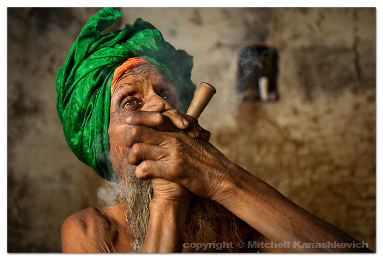
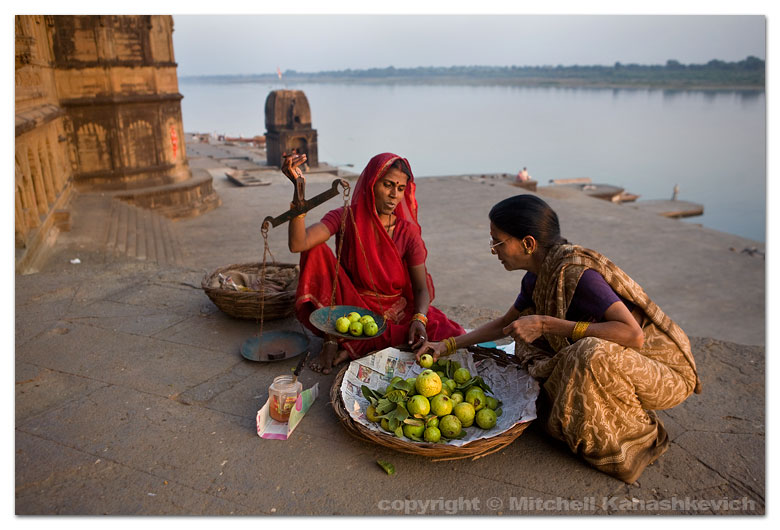
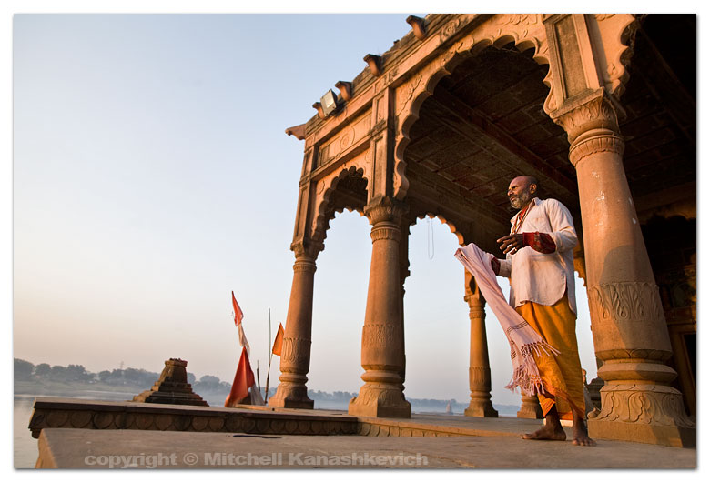
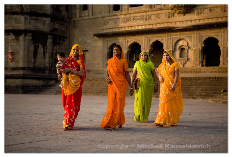
I said in the last post that I would put up some “before” and “after” images that would give people an insight into how much post-processing I do to my photographs, so here we go. As with the last post this isn’t a tutorial, but those who have a better than basic understanding of post-processing may get some ideas from this post. The “before” images which are unprocessed, as interpreted by “Caputre One”, they are on top and I have listed the key things which I have done with the post-processed "after" photographs. Click on each image for a closer view.
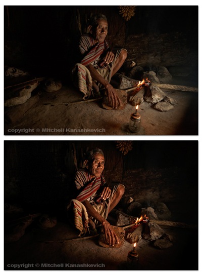
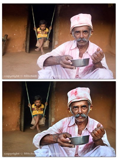
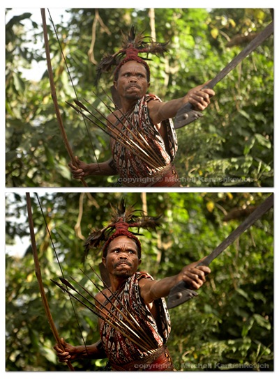
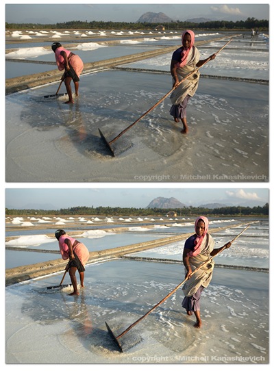 The above images have pretty much been worked on in the same way.
- Slight cropping and sometimes rotating.
- Multiple versions of the same image created at varying exposures, later made into one in Photoshop. The reason – bringing out the details in highlights and shadows.
- Curves, levels adjustment layers created, I paint inside of these wherever I feel needed, to selectively darken and lighten areas
- Shadows and highlights – to further bring out the details.
- Dodging and burning for finishing touches.
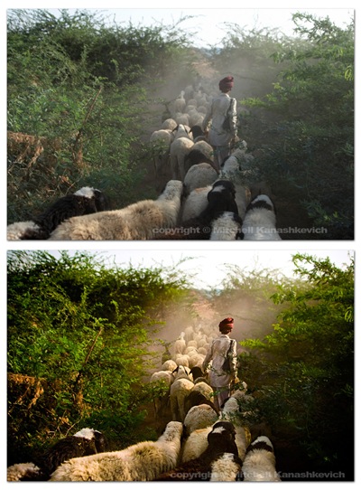 The image above had a little more done to it. On top of the previously mentioned processes I played around with the saturation and the white balance in the RAW file. More intense dodging and burning was required to add a bit of drama to the scene, to make the image look the way I remembered seeing it.
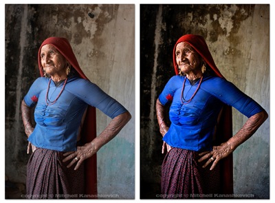 The process for the image of this grandmother was similar to the first few and I chose to clone out a little black pipe that stuck out of the wall (top/center/right). I’m not a huge fan of cloning things out and some may argue that once things start to get modified on this level, the photograph becomes less “pure”. If it’s something small that doesn’t make or break the image, but bugs me I’ll clone it out without thinking twice, if it’s something that can radically change an image I’ll usually be a bit more cautious.
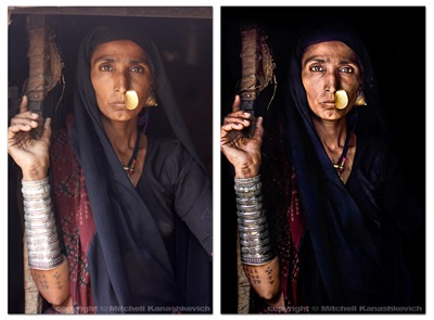 Out of the images I have presented here this one required the most work. I felt that I really needed to bump the contrasts and to dramatically darken certain parts of the photo. This sRGB conversion has a limited color range and is actually a little too dark (you loose details in the material), but you get the general idea. Same processes as stated above and just really a lot of playing around and seeing what works and what doesn’t.
That’s about it. As you can probably gather I like to keep my images looking as realistic as possible on the one side and as dramatic as possible on the other. I try to find the right balance. There are plenty of photographers who like to make their images look more dramatic, more saturated, more contrasty, to a point of surreal. There are also those who like to selectively de-saturate parts of an image, but to keep contrasts high. Lots of particular “looks” are popular these days and many people try to emulate them. Sometimes these “looks” work and sometimes they are boring, repetitive and unnecessary. I’m not really into stylizing my color shots too much. I feel that this is a bit of a fad and at times this stylization is used to mask crap light or inconsistent color. A great image will be great regardless of whether it has been realistically processed or stylized (when this is done well). A crap, stylized image may pass off as decent at first glance because it grabs you with the dramatic, surreal color, but hang it on the wall and look at it for a few days and you’ll become very bored. Maybe I am somewhat conservative - for me it’s either the dramatic, yet realistic post processing approach or if I want to do my own kind of stylizing – it’s black and white. I do quite a bit of black and white and I will post something about that in the future.

 Ok, so I thought it might be useful to let people know how I go about working on my images after I have captured them with the camera. This is not a tutorial, just some steps that I take, a word on the software that I use and some thoughts behind why I use it.I’ll start with a statement that will likely surprise many photographers; I don’t use Lightroom, at all.
In a perfect world things would be much simpler than they are and I would absolutely love if Lightroom was my answer to everything, but it’s not. “Why?” You ask. I’ll try to make it as short as I can: I really don’t like certain textures that Adobe Camera Raw creates (this is what both Photohshop and Lightroom use to interpret RAW files) and I don’t like how it handles color. The textures often look “too computer generated”, progressions of really dark tones to a really light ones are a little too harsh, too sharp and sometimes pixelated. The colors and the tones often seem to blend with each other and the image takes on a somewhat de-toned, de-saturated look.
I feel that Capture One 4 Pro handles RAW better, it’s not perfect, but for most part I find it superior to anything else. I must note that the aim of this post is not to start a debate on which software is better; I’m simply sharing my thoughts. If you want to see for yourself, download a




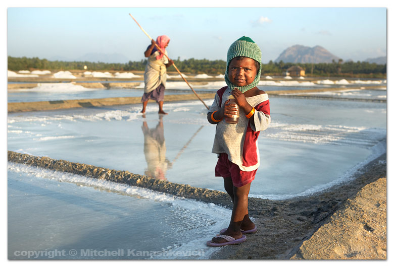
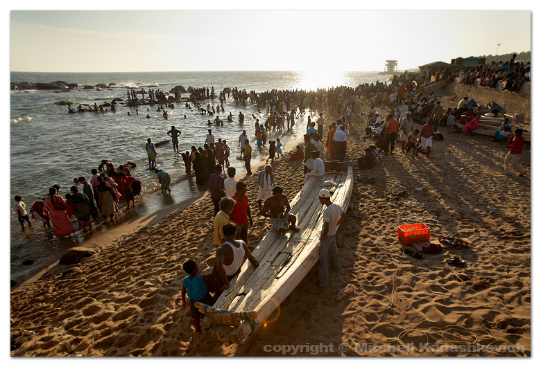
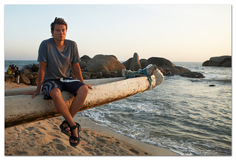

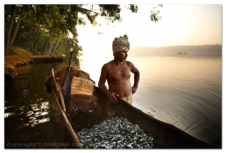

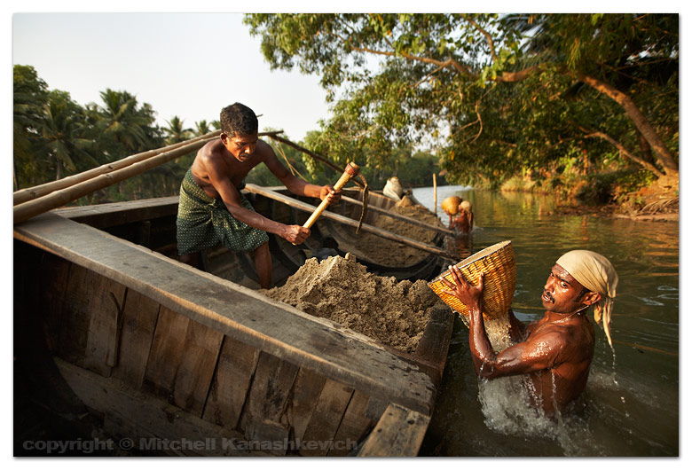


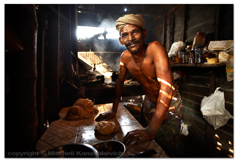


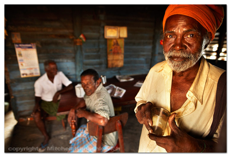


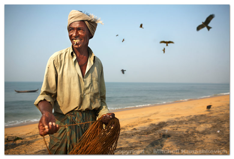


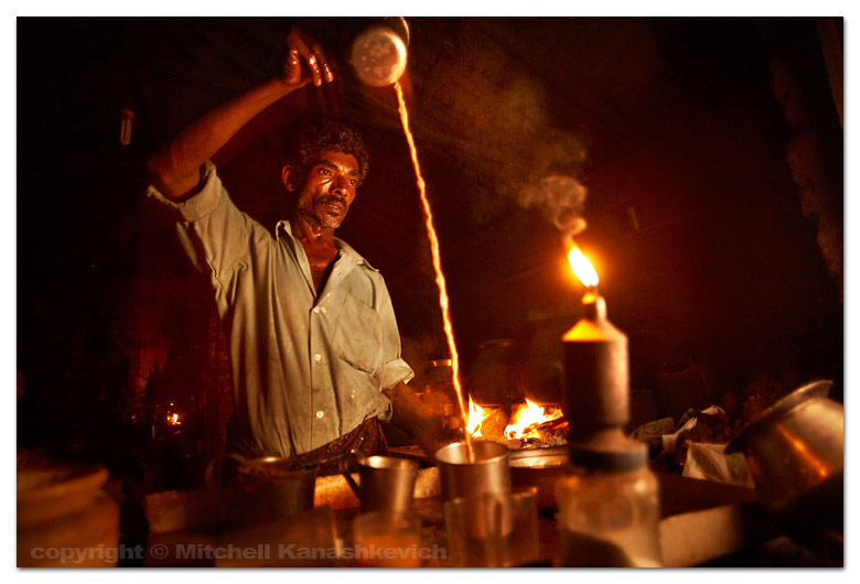


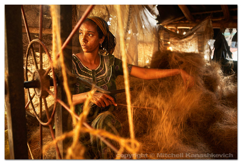
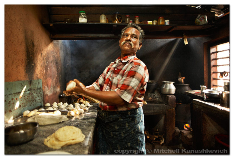
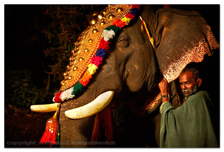


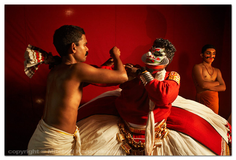
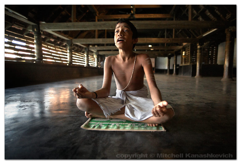


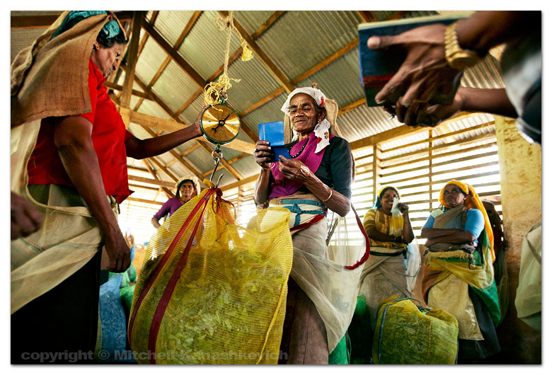


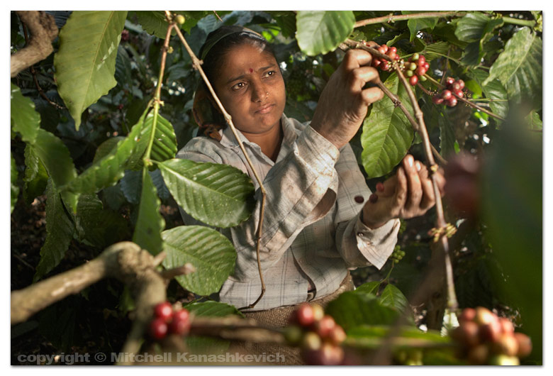

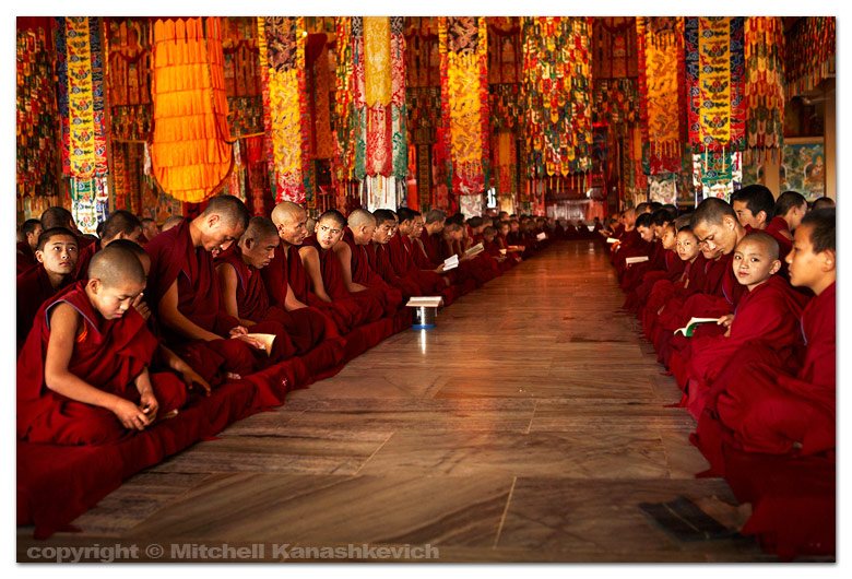

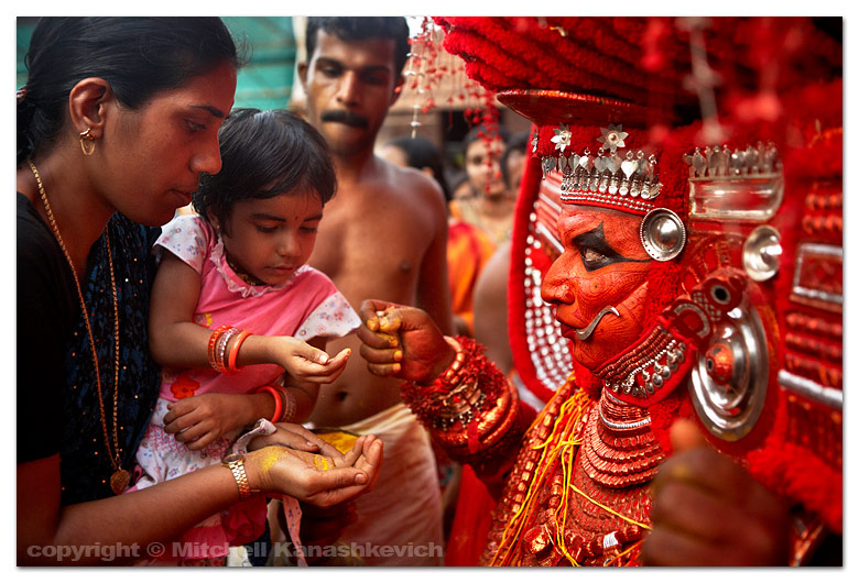 Photographing the Theyyam has been fascinating and frustrating. Fascinating because, well I think the images suggest why, and frustrating for several reasons. First there are crowds and then there are crowds of local photographers who battle for a good angle, not something I'm used to, since I rarely come across 'likeminded individuals' on my photographic quests. The next source of frustration comes from the fact that Theyyam is a deeply religious performance, in fact Theyyam means 'God' in the local language and so while the artist is performing he is basically a deity. When photographing such performances without much knowledge (learning on the spot from the fellow photographers who sometimes get reprimanded for pushing past anyone and anything) one has to tread carefully, not to offend anyone. Of course you could say that I could be better prepared and learn more about what I'm photographing, but not so. I have learned about the principal ideas and the history, however there are more than 400 Theyyam performances which are somewhat different from each other, not only that, the performances take place in different temples all the time and that means that the degree of restrictions is variable. On any given day I do not even know which Theyyam I'll be photographing.
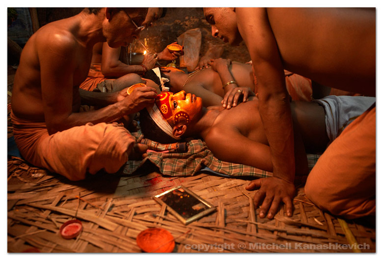
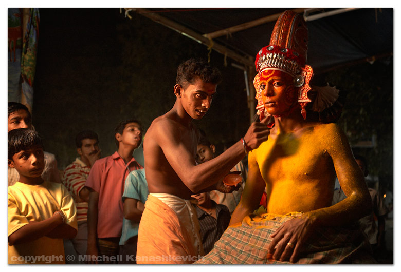 The first Theyyam the "Muhcilot" left me rather unimpressed, performance wise. In short it consisted of an elaborately dressed plump artist circling the temple and murmuring something in what I later found out to be a mixture of Sanskrit, Old Malayalam and Tamil (south Indian languages). Then the devotees rushed in, blessings were given and money started pouring in from all directions, so much money that it had to be put into baskets to be carried away. This went on for over two hours and as I later found out (I couldn't bear staying any longer) it would go into the night, until all of the devotees were blessed.
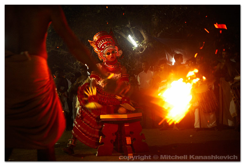
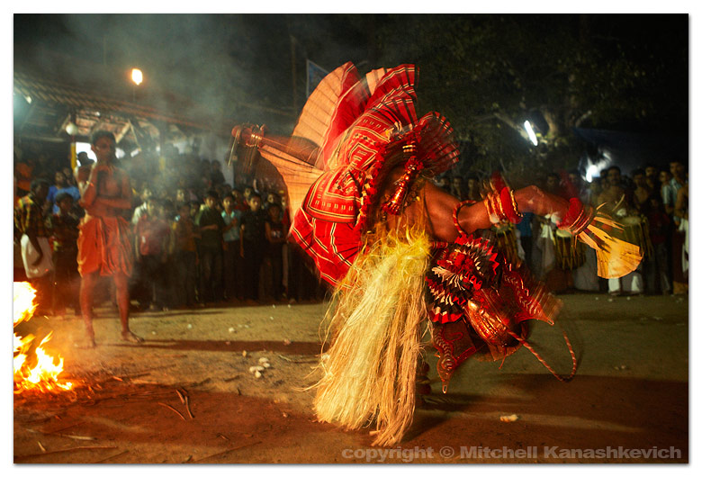 The second Theyyam was the same as the first and rather than watch it I decided to head to the Kerala Folklore Academy, to learn whether there was more to Theyyam than what I had seen. The photos on the walls of their small museum and a very brief conversation with a very-busy-overtime-working Theyyam expert left me with the belief that indeed there was much more to Theyyam. The very next night I would see just how much more. Upon arriving at another village temple I unknowingly befriended a young Theyyam artist who spoke basic English. When I found out who he was and who the small group of young men with him were (all Theyyam artists) I asked if I could photograph them while they put on their makeup and get dressed, they agreed. I photographed the whole process and then, suddenly the temple drummers began to beat a dramatic tune, the last elements of the costume were in place and the artist, as if possessed by a wild beast, jumped from his make up chair and rushed into the temple. His performance would be a stark contrast to the monotonous stuff I had seen earlier. There was fast, loud, dramatic drumming, fire, summersaults and cartwheels. The next Theyyam performance was even more impressive, with more of the same content, executed in an even more dramatic manner. The whole thing was pretty amazing, the atmosphere, the crowd's reaction and of course the Theyyam itself. Tanya and I definitely felt the magic in the air.
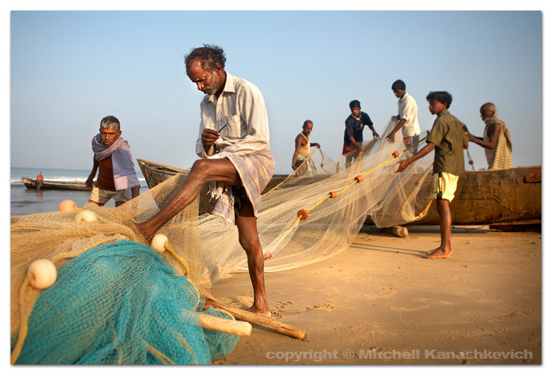


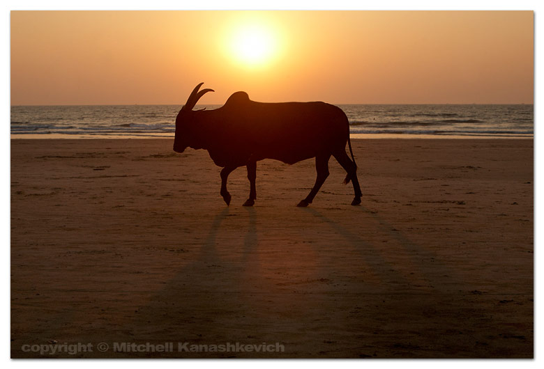 We're in Goa, in Arambol to be exact. The beach is nice and the rock formations at the North end are striking. People come here from all over the world for a dream holiday, many stay for weeks, months even. Tanya and I are getting a little bored after two days. Maybe the adventures and unpredictability of our travels make everything seem bland by comparison. Maybe we simply don't feel right in places like this. There is a mixture of dreads locks, piercings and tattoos in all imaginable places, local fashion adapted in Western ways and some wacky individuals that simply defy any descriptions. It all makes for a great people watching experience, but after a while; how much splashing in the sea and people watching of this sort can one take? Maybe we're spoilt by the beaches of Australia or maybe you need to be on something to get 'stuck' here for long. Some places in Goa are well known for drugs, I'm not into them and feel uneasy when people right in the middle of the street offer me hash and cocaine. This happened when we stopped to check out Anjuna (the place famous for the Wednesday flea market) offers started pouring from every direction as soon as we got off the motorbike. I'm kinda glad we are staying in a place where the stuff doesn't seem to be the dominant topic.Yesterday we visited Panjim, a town much more to my taste. Full of atmosphere, Portuguese architecture, bright colors and very importantly, unlike the beach villages, where everything revolves around tourism, Panjim has a life of its own. That's what I look for as a photographer and Panjim is the place where I'd like to stay for a few days, only problem is the price hikes for accommodation at this time of the year in even the most basic places. We'll see whether we'll find something suitable in the coming days. In any case we want to gradually make our way down South and continue on to Kerala, with stops at places we find interesting. For now I guess I'll have to be satisfied with lazing around on the beach. We did just have one of the more pleasant evenings in recent memory; watching a group of musicians randomly get together on the beach and listening to them play the tabla and the didgeridoo to the setting sun.
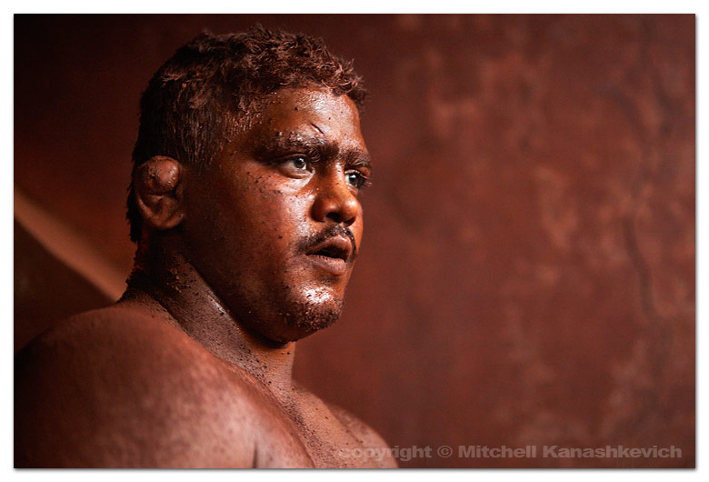
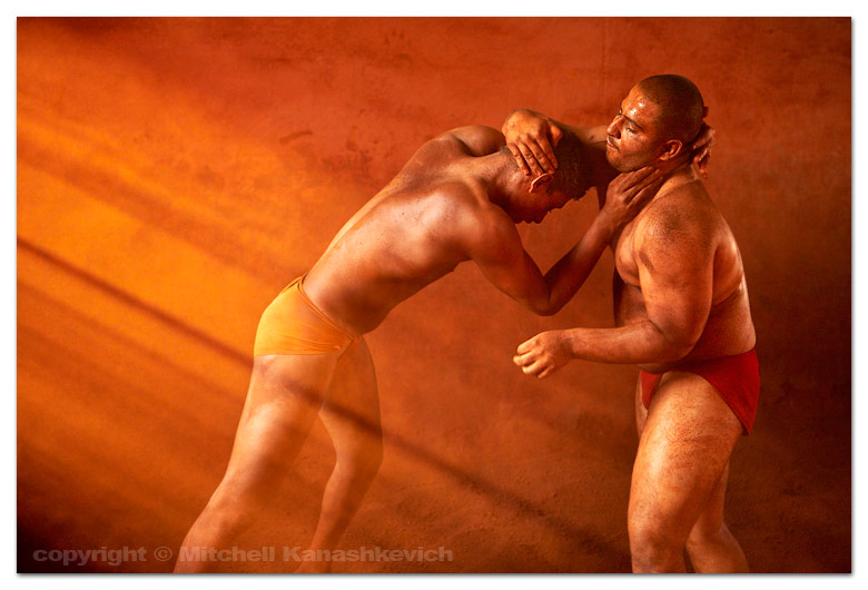

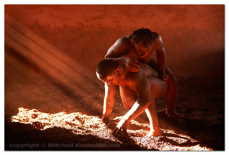
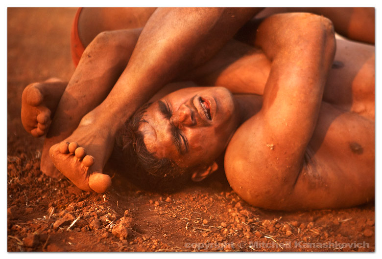
 The last ten or so days have been intense. We have covered over 1000km of road, sometimes extremely bad road, pot-holed, narrow and full of half-competent drivers. But riding on these kinds of roads often brings unexpected amusement. Close to the Madhya Pradesh/Rajasthan border we came across a 'holy man'. He had obviously been walking along the road for a long time, but he was being followed by an entourage - people with sun-blocking umbrellas and cars with large signs promoting his pilgrimage. Not so unusual for India, except for the fact that the man was completely naked.Less than one hundred kilometers later we were treated to a sighting of an almost literal clash of two worlds - the ancient and the modern. A caravan of bejeweled tribal women with camels and children (most of them on top of the camels) crossed the road as cars and trucks moving at insane speeds somehow managed to slow down in time not to run anyone over.
Our first stop was Ujjain - a place of pilgrimage that holds a great significance for Hindus around India. Every twelve years it hosts what is possibly the largest gathering of humans on earth - the Kubh Mela. The next mela is eight years away, so the city was rather subdued when we visited. Ujjain offers a glimpse of the exotic Hindu India that we often see on TV and in picture books. Every morning devotees bathe in the holy waters of the Shipra river, they wash away their sins and make offerings. The Brahmins (priests) at the riverside temples perform various religious ceremonies, the way their ancestors have for hundreds of years, the only difference now seems to be the priests' short attention span, evident from their constant checking of the mobile phone right in the middle of the ceremonies.
Our next stop at the small town of Maheshwar by the Narmada river, was meant to last for a day and a morning, but once we felt the peaceful rhythm of life here and the warmth of the locals, we got 'sucked' in and stayed three days. Maheshwar is also a place for religious pilgrimage, but it is much, much lower scale. It is what I imagine India was like a long time ago, before the whole modernization and population explosion occurred. There is definitely magic in the air, perhaps because it hasn't yet been killed by the blaring sounds from stereo systems and the large rubbish throwing crowds, so common around similar places. A walk along the riverside in Maheshwar is one of the most serene experiences one is likely to have in India and a swim in the Narmada river here at sunset is like nothing else (yes, I braved it and went in, but Narmada is not as polluted as India's other rivers). Floating in the water and seeing the huge fort and the numerous temples towering above, while the setting sun’s rays painted everything gold felt absolutely surreal.
We would have liked to stay longer in Maheshwar, but at this stage time is not a luxury we possess. Our stop at Nasik (another Kumbh Mela destination) was brief, but the next one at Pune was longer than expected. Not that I am complaining, since Pune turned out to be quite fascinating for a place where I didn't even think about photographing, but more of that in the next post.
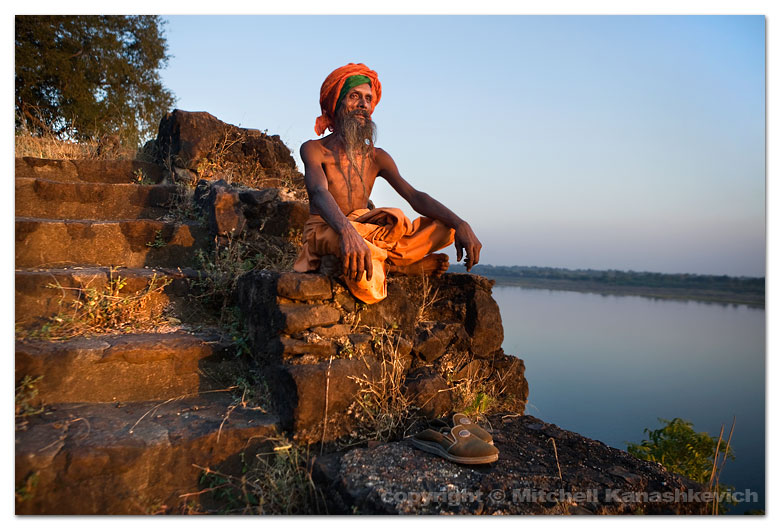
I am posting some images from Maheshwar. The first two (one at the top one below) are of a Sadhu we met at a small, isolated temple on a hill overlooking the Narmada. Sadhus are also known as holy men, ascetics and saints in India. In reality they are often very far from anything holy or spiritual. Most that I had come across were simply wanderers, beggars and in worst cases scam artists, in fact I am always cautious when a Sadhu asks me to come over and speak with him. Usually any conversation simply leads to how I should give him money, but there are also plenty of stories of naive travelers being drugged, robbed and having other not so nice things happen to them. If I am in famous pilgrimage places full of tourists I will not even waste my time, but here I was in Maheshwar (which only seems to get a trickle of visitors) and this Sadhu gestured with his hand from his temple for me and my wife to come up. While the isolated location seemed like an ideal place for something bad to happen we decided to go, we simply wouldn't drink or eat anything offered to us, paranoid maybe, but safe. The Sadhu spoke less English than I spoke Hindi and that is about 20 words. Our conversation revealed which pilgrimage places he had been to (very many). He had many children and whether they were biological or spiritual was not easy to understand, but they did live all over the world. Suddenly he got me to right down an address, which turned into a collection of random names and places in different countries. His children maybe? Finally I managed to communicate that I wanted to photograph him by the window of his room, he agreed, I asked if he could smoke his chillum (the pipe used to smoke opium) he did. There wasn't quite enough light in the room to photograph without setting the shutter speed too low, so again Tanya helped with the flash from the window side, used in a softbox at 1/64 of the power. The next image was taken outside of the Sadhu's temple. The sun was setting and the location seemed perfect, with the Narmada in the background. After the little photo session the Sadhu invited us to follow him somewhere, just for five minutes. We got a bit worried, as that's how those horror stories usually started, but again decided to take the risk. At this stage the Sadhu's nature seemed quite friendly, even if a little mad. We followed along a narrow path surrounded by vegetation and ended up at what seemed like another temple and a small room. There were houses with people nearby and one young man spoke some English. I asked him whether the Sadhu wanted us to come with him for some particular reason. – No, he just wanted to offer you food and milk, just ‘time pass’. It really didn’t seem like the Sadhu had too much to offer, so we politely declined and instead took down the address of his temple, to send him the photographs.
